


Create Your First Form
IPS – Contact Form to Any API lets you create forms for your Shopify store without building everything from scratch. You can start with a ready-made template or create a form from a blank page and configure the fields, design, submission behavior, emails, and validation messages to match your needs.
This guide walks you through the full process of creating your first form.
Step 1: Start a new form
You can create a form from two places in the app:
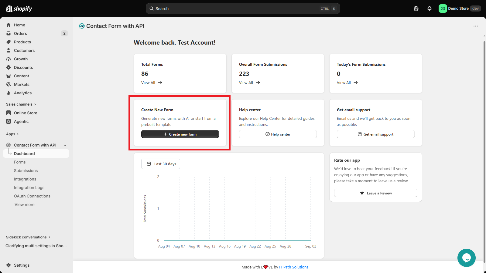
- From the Dashboard, select + Create New Form.
- Or, go to Forms and select Create new form.
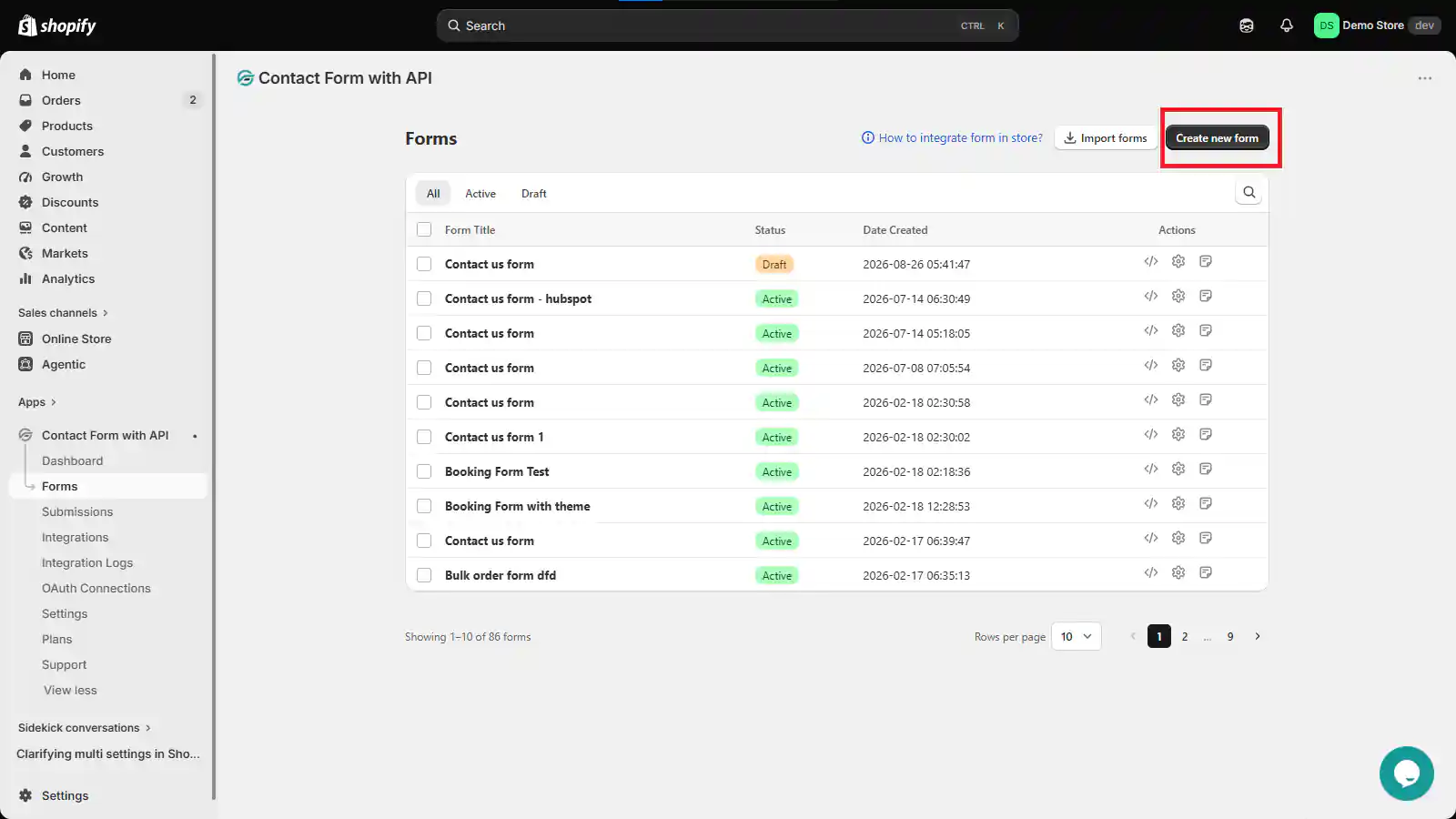
You will then be taken to the form template screen.
Step 2: Choose how you want to build your form
When you create a new form, you can either start with a ready-made template or build one from scratch.
1. Use a ready-made template
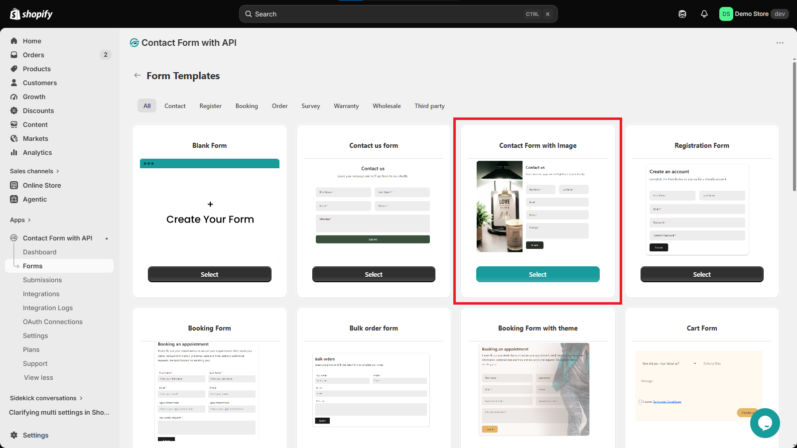
IPS – Contact Form to Any API includes 30+ ready-made templates that cover different use cases.
The templates are organized into categories such as:
- Contact Us
- Register
- Booking
- Order
- Survey
- Warranty
- Wholesale
- Third Party
Choose a template that is close to what you need. You can then edit the form and adjust its fields, content, and design.
2. Create a form from scratch
To build your own form, select Create New Form and start with a blank form.
The form builder includes separate sections for Elements, Appearance, After Submit, Mail, Integration, and Settings.
You can also rename the form using the pencil icon next to the form name at the top of the builder.
Step 3: Add elements to your form
Open the Elements section to start adding fields to your form.
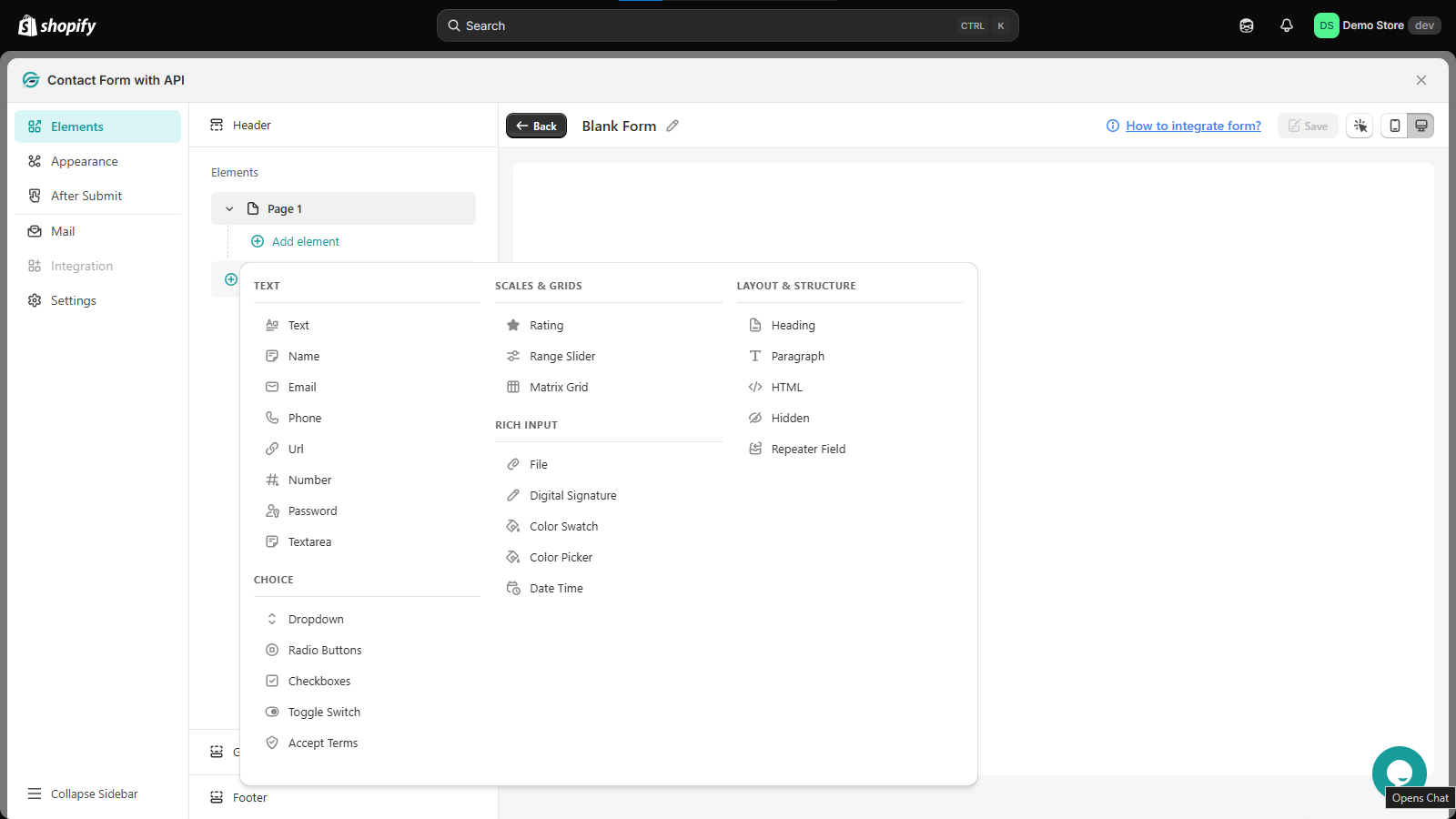
Select Add element to view the available field types. IPS – Contact Form to Any API provides 20+ elements across different categories.
1. Text
Use these fields to collect standard text and contact information:
- Text
- Name
- Phone
- URL
- Number
- Password
- Textarea
For example, you can use Name and Email fields for a contact form, Number for an order quantity, or Textarea for a customer’s message.
3. Scales & Grids
These elements are useful when you want customers to provide a rating or select values from a scale.
- Rating
- Range Slider
- Matrix Grid
4. Rich Input
Use these elements when you need to collect more specialized information:
- File
- Digital Signature
- Color Swatch
- Color Picker
- Date Time
5. Choice
These elements let customers select one or more options:
- Dropdown
- Radio Buttons
- Checkboxes
- Toggle Switch
- Accept Terms
6. Layout & Structure
These elements help you organize and structure the form:
- Heading
- Paragraph
- HTML
- Hidden
- Repeater Field
Add the elements you need and arrange your form based on the information you want to collect.
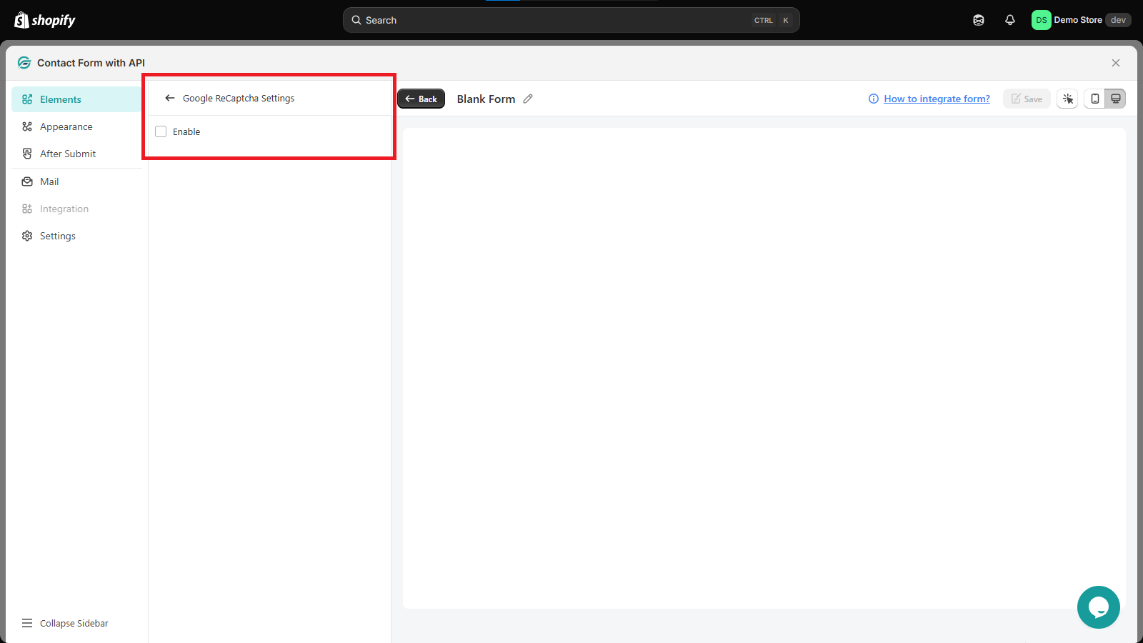
7. Configure Google reCAPTCHA
You can add Google reCAPTCHA to your form to help prevent unwanted or automated submissions.
- In the Elements section, scroll down to Google reCaptcha Settings.
- Select the Enable checkbox.
- Configure the reCAPTCHA settings as needed.
Once enabled, reCAPTCHA will be added to the form and can help verify that submissions are coming from real users.
8. Customize the form footer
The Footer section lets you control the content and layout of the area at the bottom of your form.
You can customize:
- Custom text – Add text that you want to display in the footer.
- Submit text – Change the text shown on the submit button.
- Reset button – Add a reset button so users can clear the form fields.
- Reset button text – Set the text that appears on the reset button.
- Full width footer button – Make the footer buttons span the full available width.
- Alignment – Set the alignment of the footer text and buttons to Left, Center, or Right.
Use these options to adjust the footer to match the way you want customers to interact with the form.
Step 4: 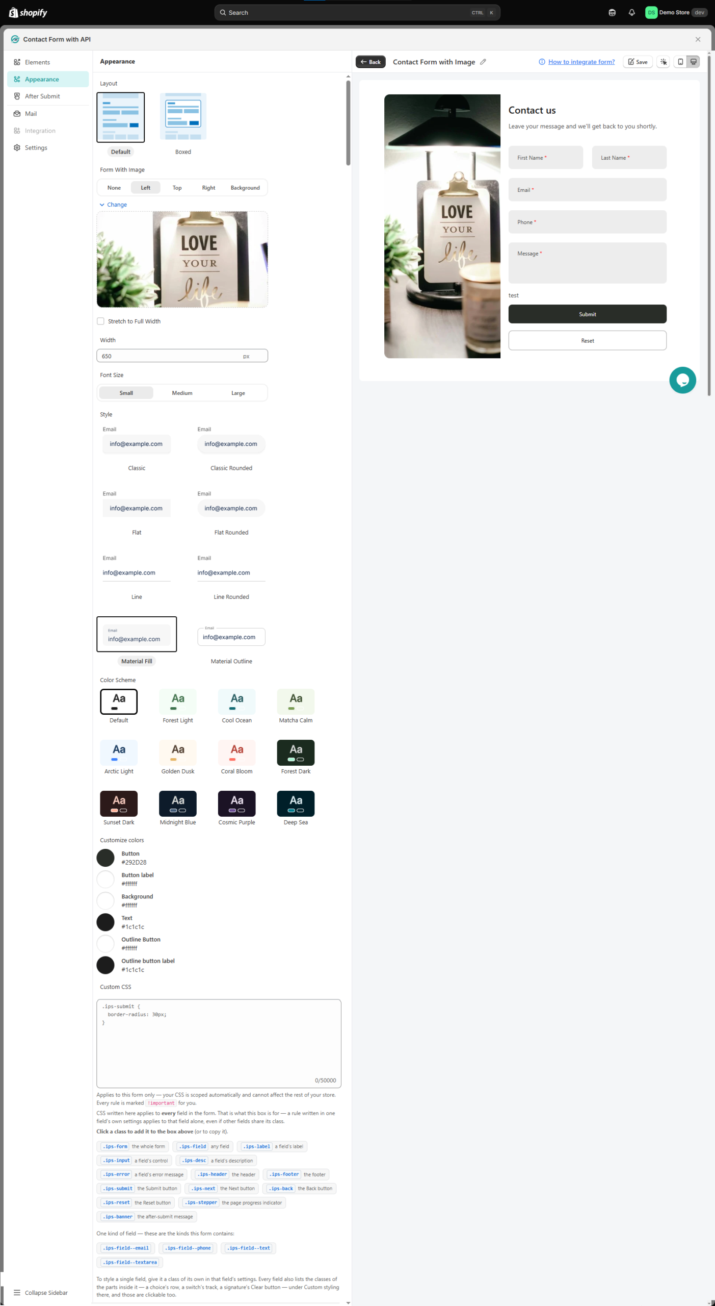
Once your fields are in place, open Appearance to change how the form looks.
You can customize the layout, image, field styling, font size, and colors from here.
1. Choose the form layout
You can choose between:
- Default
- Boxed
Select the layout that best fits the design of your Shopify store.
2. Add an image
You can add an image to your form and choose where it appears:
- Left
- Right
- Top
- Background
When using an image, you can also select Stretch to full width to make the image span the full width of the available form area.
3. Set the form width
Use the form width setting to control how wide your form appears.
You can enter the width in pixels to match the space available on your store page.
4. Choose the font size
Set the form’s font size to:
- Small
- Medium
- Large
5. Choose a field style
You can change the appearance of individual form fields by selecting a field style:
- Classic
- Classic Rounded
- Flat
- Flat Rounded
- Line
- Material Fill
- Material Outline
6. Choose a color scheme
IPS – Contact Form to Any API includes several ready-made color schemes:
- Default
- Forrest Light
- Cool Ocean
- Matcha Calm
- Arctic Light
- Golden Dusk
- Coral Bloom
- Forrest Dark
- Sunset Dark
- Midnight Blue
- Cosmic Purple
- Deep Sea
You can also use custom colors when you want the form to match your store’s branding more closely.
Step 5: Set what happens after the form is submitted
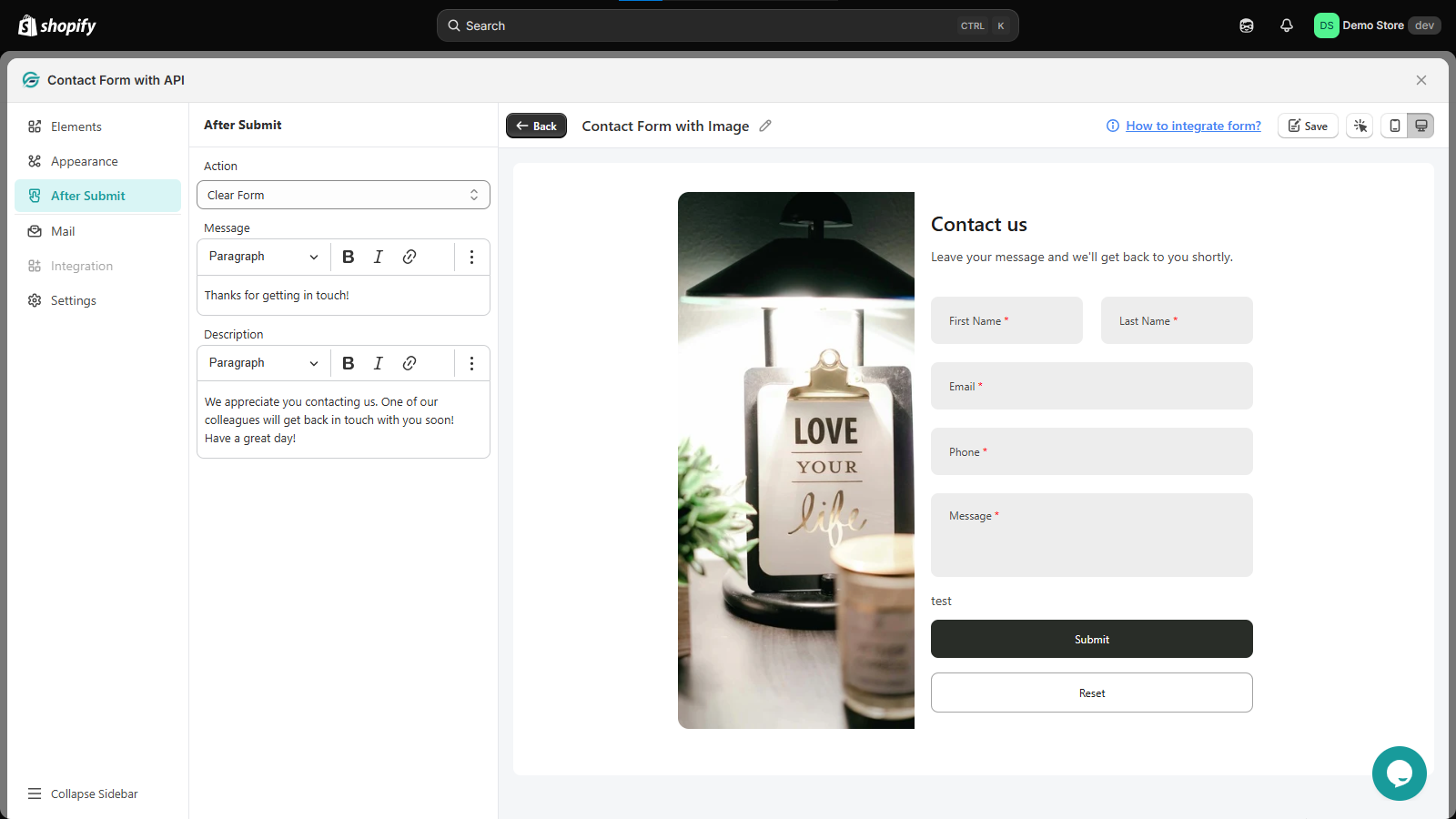
Open After Submit to decide what users see after they successfully submit the form.
Under Action, you can choose from:
- Clear Form
- Redirect to page
- Hide Form
You can also add a custom message and description.
For example, instead of showing a generic confirmation, you can display a message such as “Thanks for getting in touch!” followed by a short description explaining what happens next.
Choose the action that fits your form and then customize the message shown to the customer.
Step 6: Configure admin email notifications
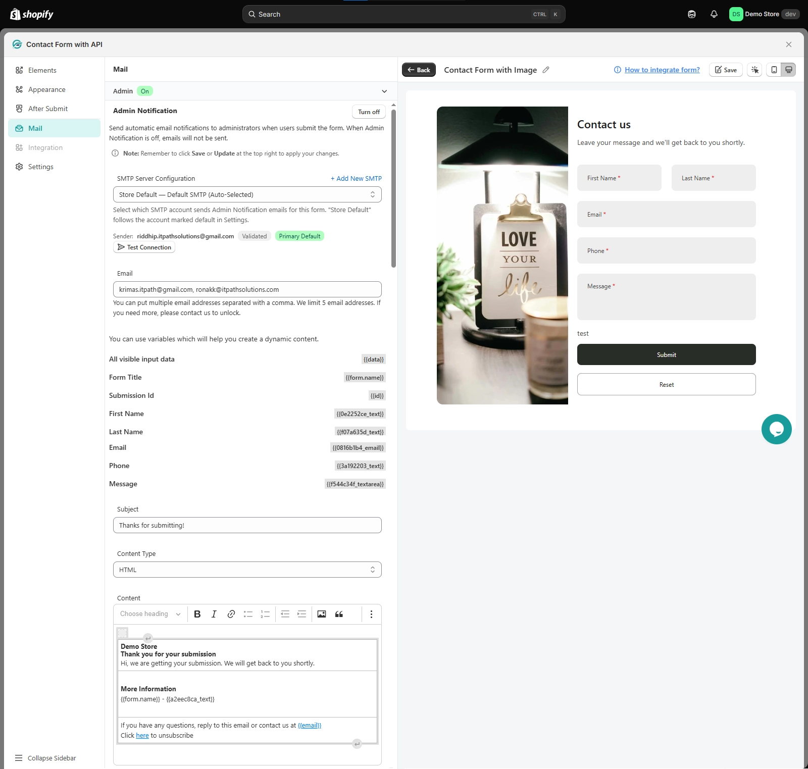
Open the Mail section and expand Admin to configure notifications for your team.
Turn Admin Notification on to send an automatic email to administrators whenever someone submits the form.
When Admin Notification is turned off, admin notification emails will not be sent.
1. Select the SMTP server
Under SMTP Server Configuration, select the SMTP account you want to use to send emails.
You can:
- Use Store Default, which follows the SMTP account marked as the default in Settings.
- Select another configured SMTP account.
- Select Add New SMTP to add a new SMTP configuration.
You can also use Test Connection to check the SMTP connection before using it.
2. Add notification email addresses
Enter the email address or addresses that should receive the form submission notifications.
Multiple email addresses can be entered by separating them with commas. The interface supports up to 5 email addresses.
3. Use variables in your email
The Mail section provides variables you can use to create dynamic email content.
These can include form information, the submission ID, and values submitted through individual fields.
This lets you create emails that automatically include the details entered by the customer.
Step 7: Set up the Auto Responder
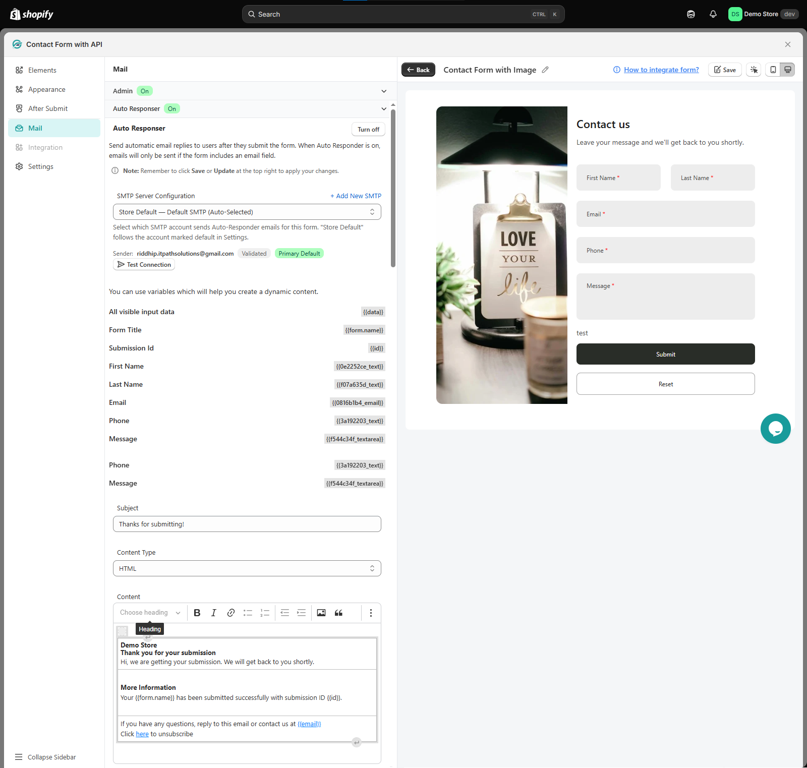
The Auto Responder lets you send an automatic email to the user after they submit the form.
Turn Auto Responder on to enable it.
Like Admin Notification, you can select the SMTP server that should send the email, test the SMTP connection, and use available variables to create dynamic email content.
The Auto Responder only sends an email when the form includes an Email field, since the submitted email address is needed to send the response to the user.
You can use variables in the email content to include submitted information or other form details.
Step 8: Customize form error messages
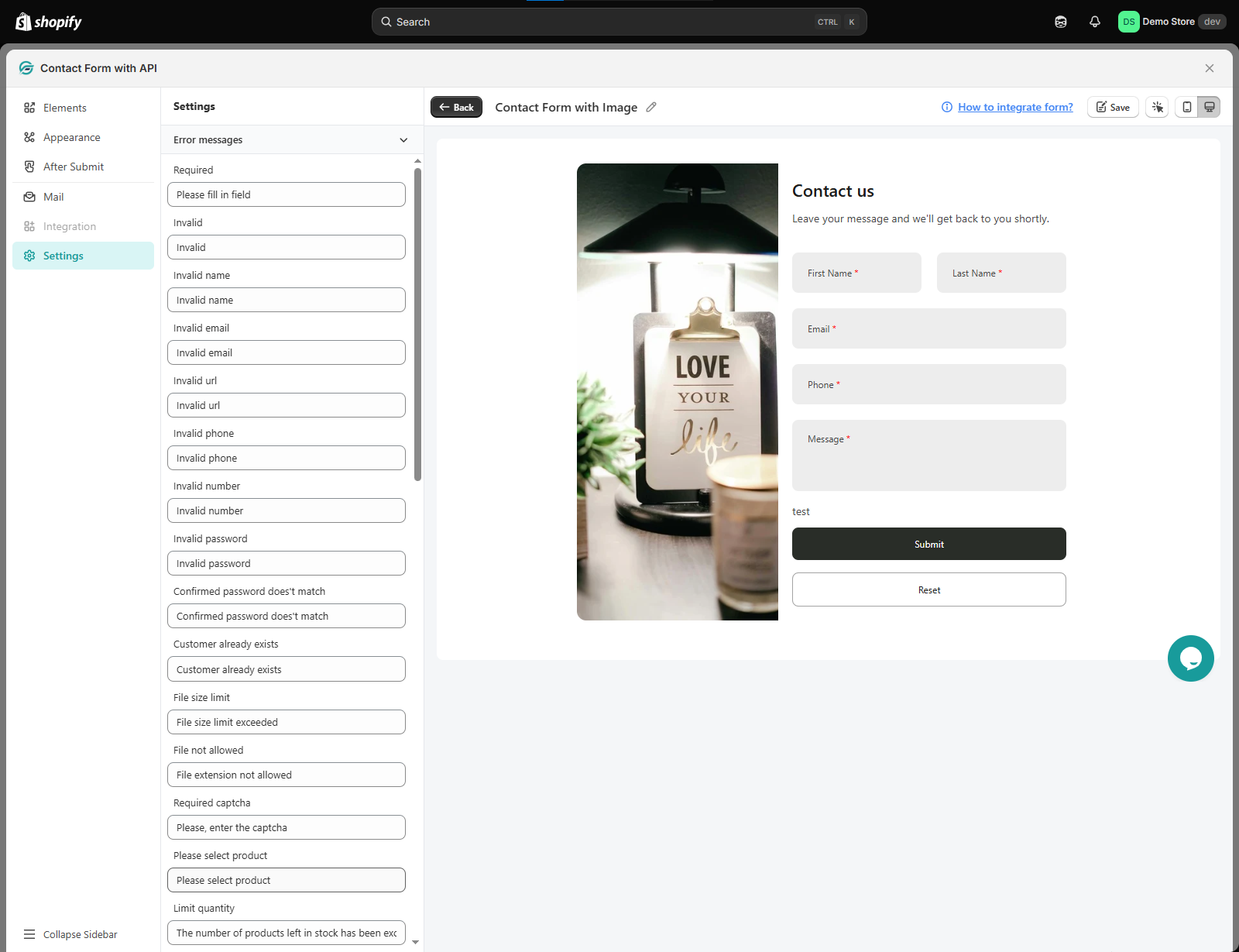
Open Settings to customize the messages users see when a form field fails validation.
Instead of using the default error text, you can change the message shown for different situations, including:
- Required
- Invalid
- Invalid name
- Invalid email
- Invalid URL
- Invalid phone
- Invalid number
- Invalid password
- Confirmed password doesn’t match
- Customer already exists
- File size limit
- File not allowed
- Required captcha
- Please select product
- Limit quantity
For example, you can replace a generic “Please fill in field” message with wording that better matches your store.
These messages give customers clearer instructions when they need to correct something before submitting the form.
Step 9: Review and save your form
Before finishing, review the form in the preview area to make sure the fields, layout, styling, confirmation behavior, and email settings look the way you expect.
When everything is ready, select Save in the top-right corner.
Your form is now created and ready for the next step of adding it to your Shopify store.
You can also check your form preview for both mobile and desktop devices.
Note: You can follow these same steps even if you have chosen a ready-made form template to work with.
Create Multi-page form
For longer forms, you can split the fields across multiple pages instead of showing everything on one page. This makes the form easier for customers to complete and keeps each step focused.
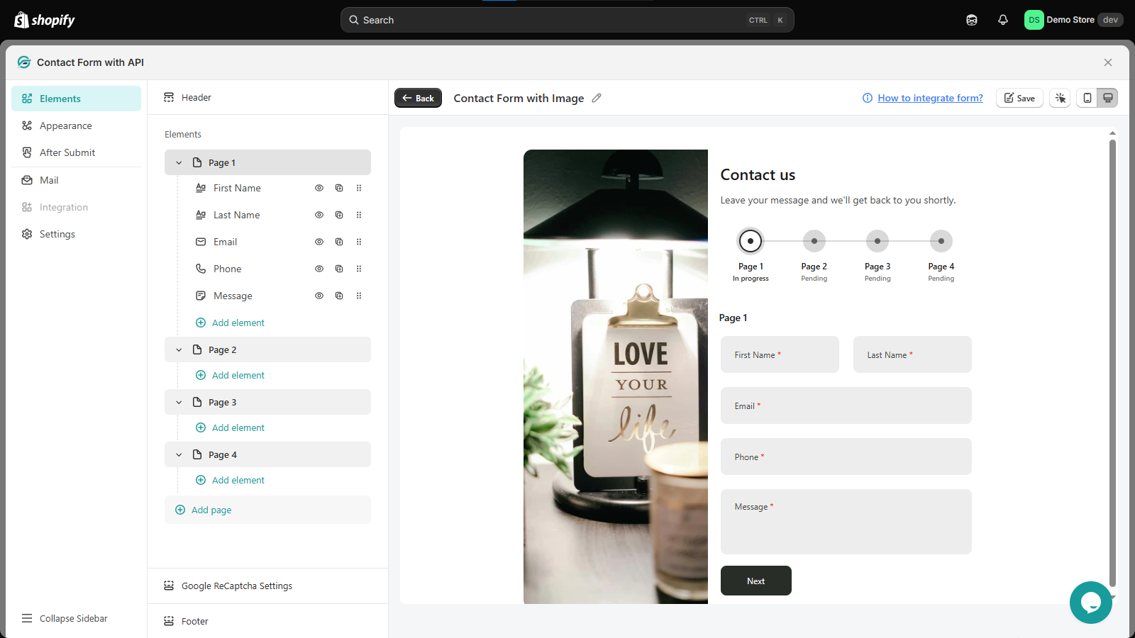
Add pages to your form
- Configure the fields and settings for your first page.
- In the Elements section, select Add page.
- A new page will be added to the form.
- Select Add element under the new page to add the fields you need.
- Repeat the same process to add more pages.
You can add as many pages as you need and organize your form according to the information you want to collect.
Each page has access to the full set of form elements, so you can add any of the available fields to any page. For example, one page can collect contact details, another can collect booking information, and another can collect additional preferences.
Customers can move between pages using the Back and Next buttons. The form also shows their current progress, making it clear which page they are on and what remains to be completed.
This is especially useful for registration forms, booking forms, surveys, wholesale applications, and other forms that require several sections of information.
You’re ready to go
That’s it. You can now add the form to your Shopify store and start collecting submissions. Before publishing, take a quick look at the form on both desktop and mobile to make sure the fields, layout, messages, and submission flow work as expected.
You can always come back to the form later to update its fields, appearance, email settings, or other options as your requirements change.
Import an existing form
Already have a form exported from IPS – Contact Form to Any API? You can import it instead of creating the form again from scratch.
To import a form:
- Open the Import forms option from the Forms section.
- Select Choose file, or drag and drop your
.jsonfile into the upload area. - Select Import forms.
The file must be a .json file exported from IPS – Contact Form to Any API. The app accepts exported files with the required fileType and supported version format shown in the import window. You can select Download sample file from the import window to see an example of the expected format.
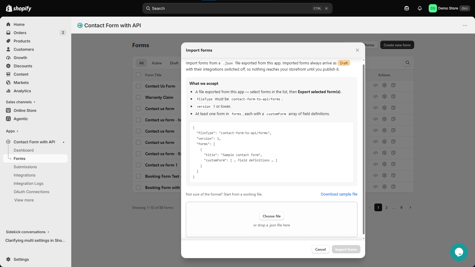
What happens after importing?
Imported forms are added as Drafts. Their integrations are switched off by default, so the imported form will not send data anywhere or appear on your storefront until you review and publish it.
After importing, open the form and check its fields, appearance, submission settings, email configuration, and integrations. Make any changes you need, enable the required integrations, and publish the form when it is ready.
Note: Only forms exported from this app can be imported. The JSON file must contain at least one form with its field definitions in the required format.